AKROPOLIS KAUNAS. VISUAL IDENTITY
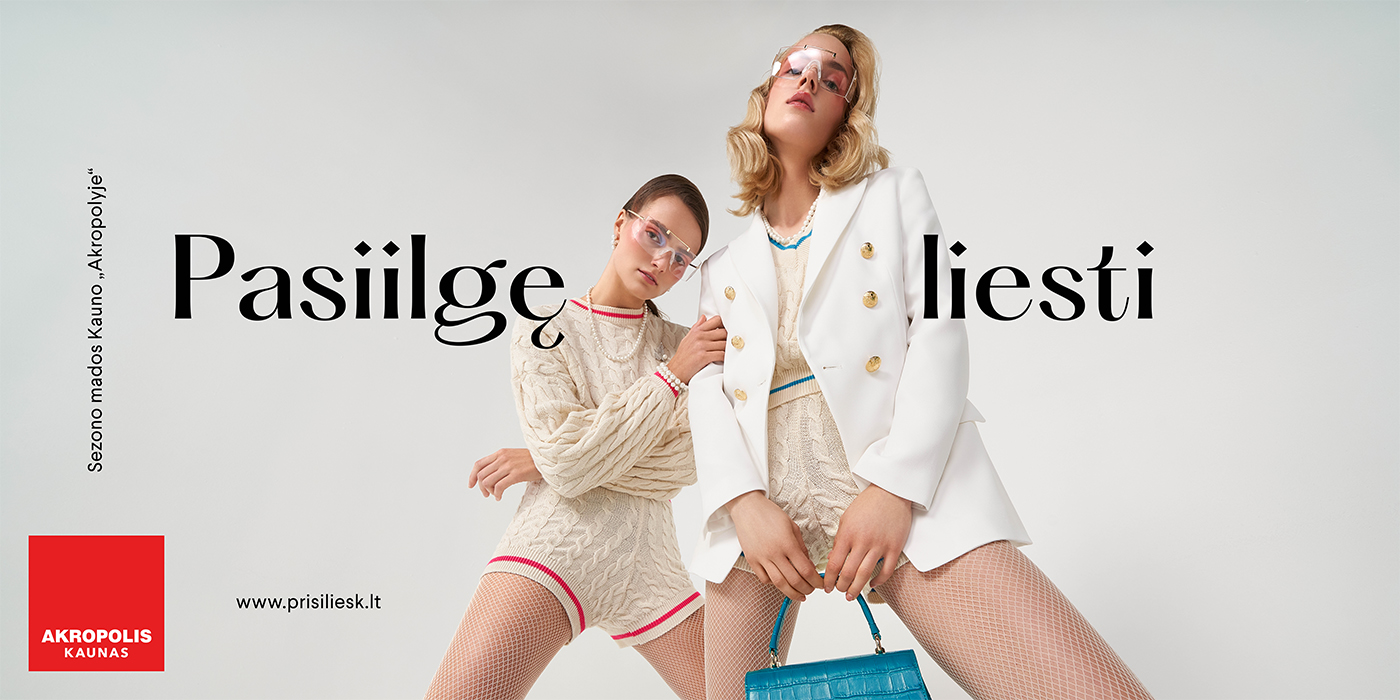
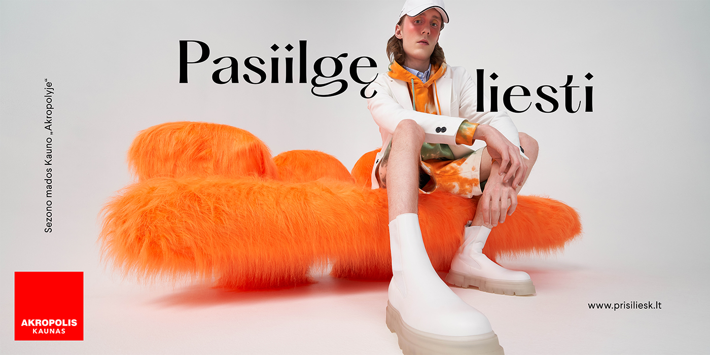
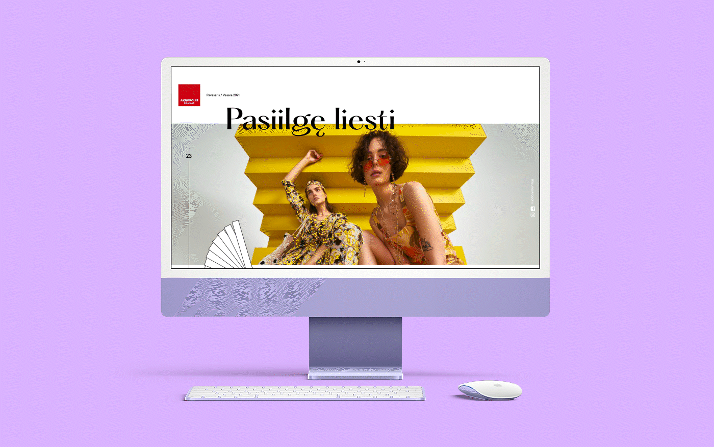
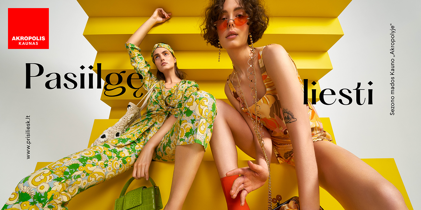
All client jobsAkropolis Kaunas is a shopping center with a strong emphasis on fashion. Communication-wise it has a bold and provocative tone that always follows new and exciting trends. Our task was to create a brand ID that would accompany and complement these values. That meant we needed something modern, versatile, fashionable, and having enough space to adapt and create, while keeping the core of the old branding intact.
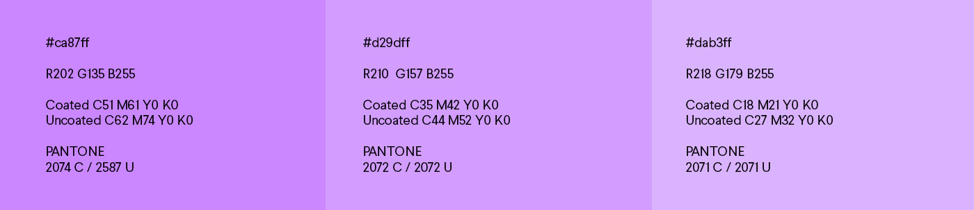
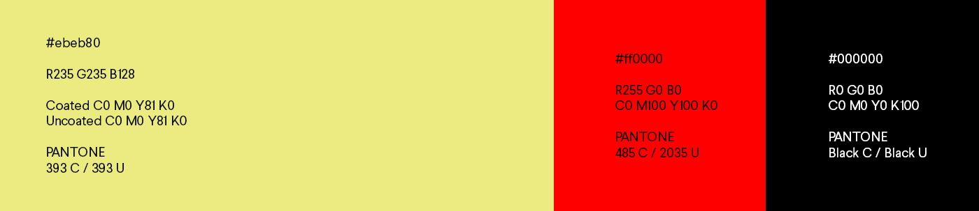
COLORS
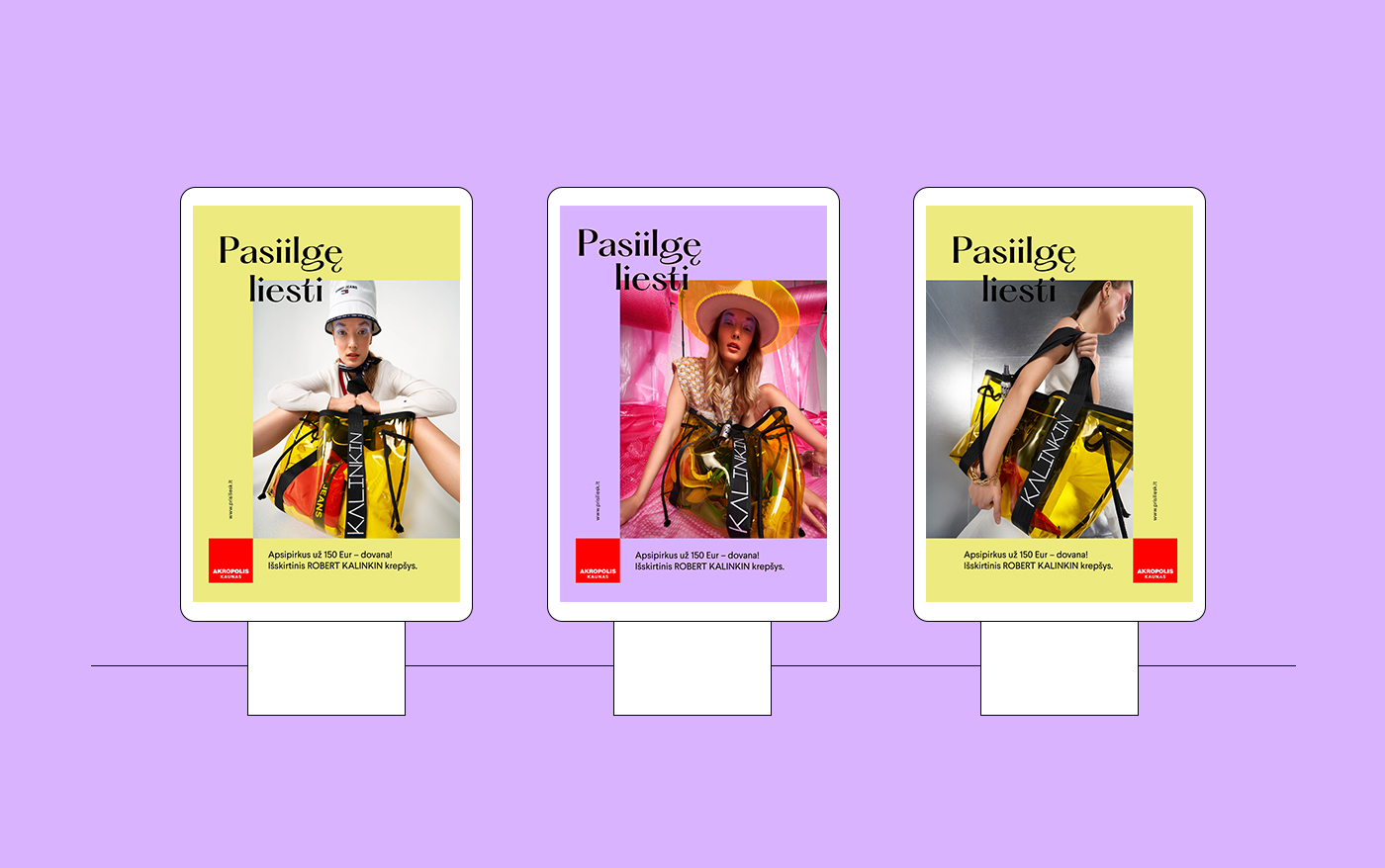
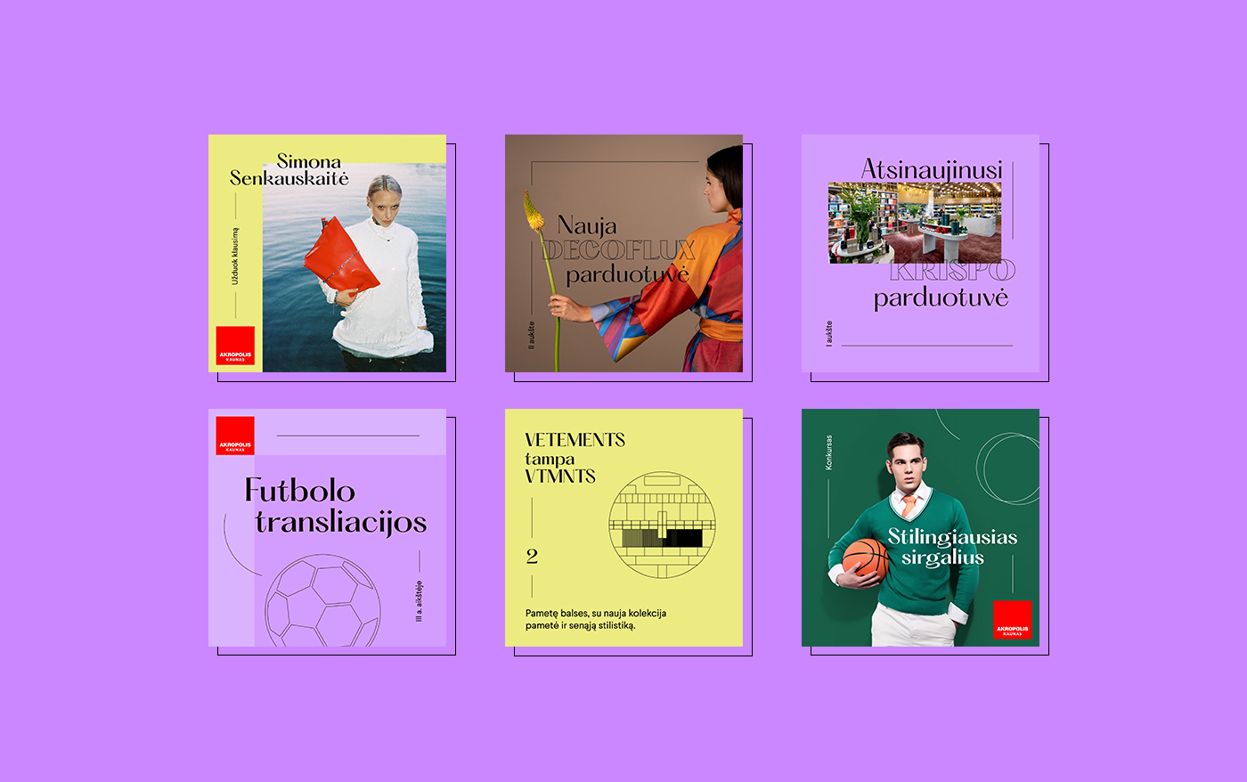
Since the primary color of the logo is red, we wanted it to stand out. We made it pop by pairing the red with a contrasting color palette of purple and electric green. The complete palette creates many design opportunities - from subtle and clean, to bold and daring.
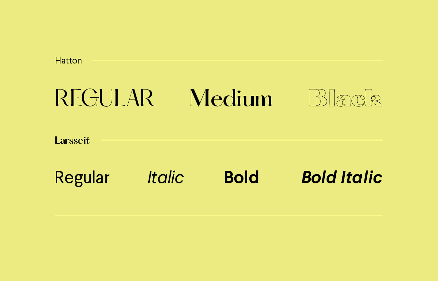
FONTS
For the header typography we chose a unique and stylish Hatton. Using three different weights we can create variety and flexibility, with a feeling of classy yet modern fashion. For the body text we chose Larsseit. It is a contemporary sans-serif typeface with reduced contrast and classical proportions which goes well with Hatton.
GRAPHIC ELEMENTS
Akropolis Kaunas is all about fashion, and communication is strongly based on impactful visuals. For the graphic language we wanted minimalism and complete freedom. Each one is created on-demand, unique to each campaign. The only rule is an evenly thin line.

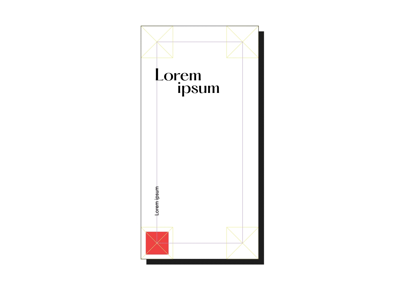
FLEXIBLE GRID SYSTEM
The grid system is based on the brand elements – mainly its logo and shape. The logo can be placed in any corner and its center forms an inner guideline for the header and additional text. Images can be placed over the entire area or framed, creating a very dynamic design solution.